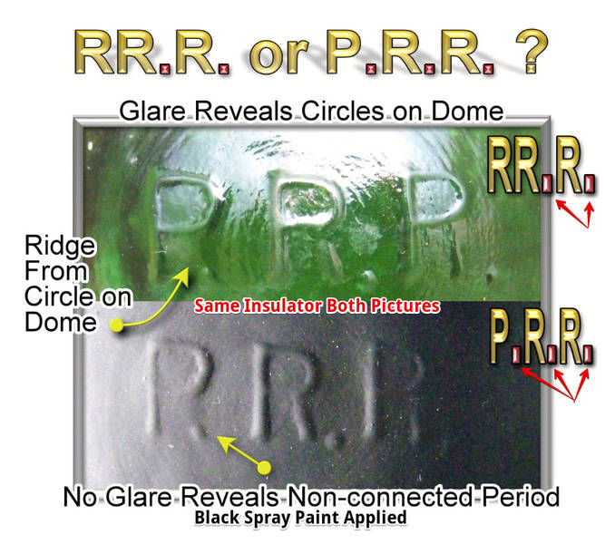
Same insulator - lower picture sprayed flat black to eliminate glare. The following is from an extensive, three-part article I wrote and submitted to CJOW (2016?). Updated info included. Theory: The concentric circles (tooling marks) on dome makes the eye see the first "P." as the letter R. Data for theory: 1. Font Switching: Unlike the other two Rs, the (alleged) 1st one has a curved front leg. People do not normally switch fonts while writing (or engraving) a word/term. 2. Coincidental Concentric Curve: Following the curvature of the 1st letter's front "leg" upward, we see it exactly coincides with one of the dome's concentric circles. The circle's arc is conveniently in the right position to make the P look like it has a front leg under normal lighting conditions. The width of the "leg" on its curve is also more thin than other parts of the letter, adding to the idea of this being an arc from the circle. 3. The Missing Period: The isolated period of the last picture means the embossing is: P {period} R {period} R {period}; like it should be. If the rst letter is an R, the embossing is missing the rst period: R R {period} R {period} 4. I have masked the embossing on PRRs to find 7 different molds (so far). Two different molds were verified as looking like RR.R. errors but also having strongly embossed P.R.R. counterparts. Hence it is likely the RR.R. error, on these pieces, was simply from the glass not taking a good impression of the period after the first P. The above is characteristic of the four individual "RRR" 162.5s I have handled. If any collector does own a crisply embossed R.R.R. that holds up even under magnifcation, I would be very pleased to know I am wrong! |