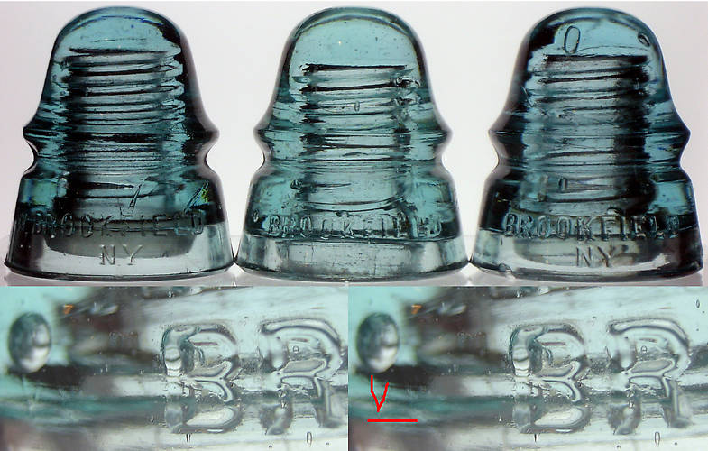
Left to right are CD 160 BROOKFIELD [070] (with the "W"), [080] (with the blotout of the "W"), and [060] (no "W", no blotout). Below that is a closeup view of the blotout. It is difficult to see, so the right hand picture underlines the area where the "W" appears, as well as highlights the most obvious portion of the "W". Visually, the "W" is just visible, as a faint but distinct "W" with no distortion or "drilling out" of the letter at all. It is there, just significantly less bold than the rest of the lettering, to the point of being hard to notice if you aren't looking for it. NOTE: The "NY" below BROOKFIELD is hard to see in the middle piece, but it really is there! |