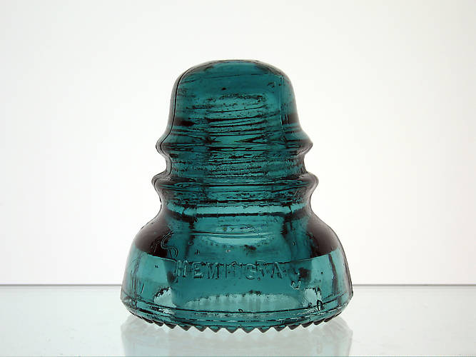
While this might not be considered an error in the strictest sense, this is quite simply the most misaligned letter I've ever seen. Check out the "Y" in Hemingray... it's so far down, the top of the Y is aligned with the bottom of the A. To top it off, the G and R are crammed together (the R being higher). Just a fun embossing I got a kick out of and decided to pick up a few years back. |